

Getting started with Tailwind CSS and Responsive Design in Tailwind CSS
Quick Guide of Tailwind CSS and Responsive Design in Tailwind CSS


Reasons to use Tailwind CSS?
Tailwind CSS works by scanning all of your HTML files, JavaScript components, and any other templates for class names, generating the corresponding styles and then writing them to a static CSS file.
It's fast, flexible, and reliable — with zero-runtime.
Installation
Regarding the other way of installation part I would like to recommend to check the Tailwind CSS documentation, all the steps are mentioned with commands and its very easy to follow.
Here I'm showing you installation process of Tailwind CSS using Play CDN
Add the Play CDN script to your HTML
Add the Play CDN script tag to the of your HTML file, and start using Tailwind’s utility classes to style your content.
Add Tailwind CSS script in Head tag
<script src="https://cdn.tailwindcss.com"></script>
After adding Tailwind CSS script in Head tag use class to customize your content.
Try customizing your config
Edit the tailwind.config object to customize your configuration with your own design tokens.
add tailwind.config script just below your Tailwind CSSscript and cutomize your config
  <script>
    tailwind.config = {
      theme: {
        extend: {
          colors: {
            clifford: '#da373d',
          }
        }
      }
    }
  </script>
Responsive Design
Remember, tailwind is a mobile first framework, its made our life easy in terms of making responsive websites.
Every utility class in Tailwind can be applied conditionally at different breakpoints, which makes it a piece of cake to build complex responsive interfaces without ever leaving your HTML.
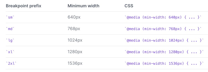
There are five breakpoints by default, inspired by common device resolutions:
Mobile First
By default, Tailwind uses a mobile-first breakpoint system, similar to what you might be used to in other frameworks like Bootstrap.
<!-- This will center the text on mobile, and left align it on screens 640px and wider -->
<div class="text-center sm:text-left"></div>
Targeting a single breakpoint
Tailwind’s breakpoints only include a min-width and don’t include a max-width, which means any utilities you add at a smaller breakpoint will also be applied at larger breakpoints.
<div class="bg-green-500 md:bg-red-500 lg:bg-green-500">
  <!-- ... -->
</div>
Customizing breakpoints
You can completely customize your breakpoints in your tailwind.config.js file:
 module.exports = {
   theme: {
     screens: {
       'tablet': '640px',
       // => @media (min-width: 640px) { ... }
       'laptop': '1024px',
       // => @media (min-width: 1024px) { ... }
       'desktop': '1280px',
       // => @media (min-width: 1280px) { ... }
     },
    }
  }