What I was using before ?
Previously, I was using a core CSS. I wanted to pick a framework that was as close to the final design as possible. there are multiple option but i decided to go with tailwind css as I already clear all CSS concept it easy for me to play with tailwind CSS.
Why did I choose Tailwind CSS ?
Tailwind CSS has a number of good reasons to use it as a CSS framework. Let's see some of them:
It makes the styling process much faster since we don't have to leave our markup; we can write CSS and HTML for the website simultaneously.
Tailwind CSS has a lot of pre-built classes for sizing and colours that will altogether remove the need to implement a design system from scratch.
We can quickly implement media queries using Tailwind CSS to make our websites responsive.
Why i choose this project
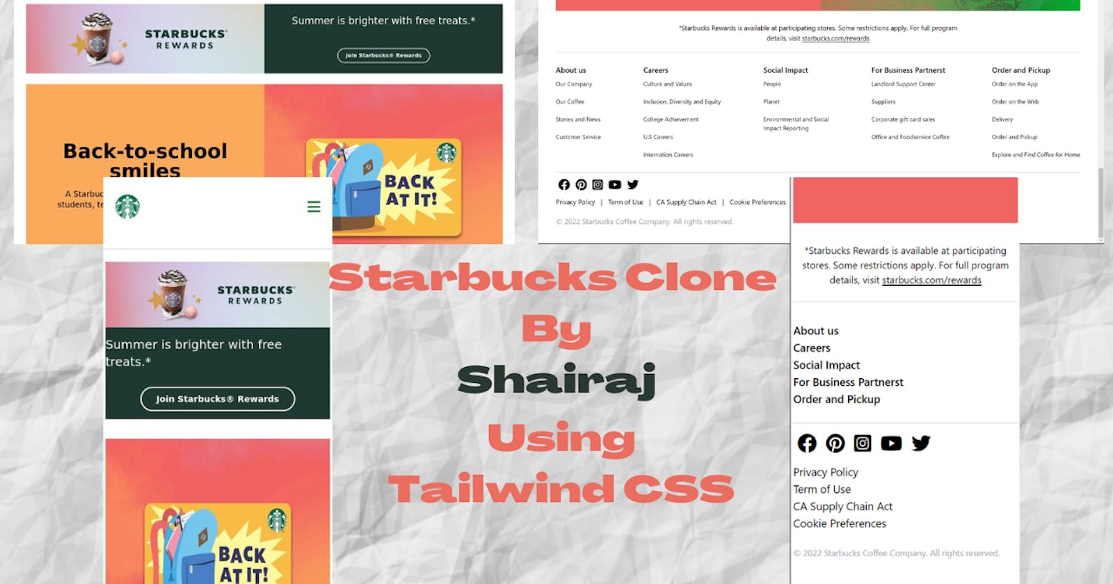
Main motive to choose Starbucks site is it simpler for new learner as you can see in image there is one navbar , 4 hero section and footer which include socials. and more important its note more complex.
My Learnings and Experiences
Already i know most of concept of Core CSS so it is easy for me to use tailwind CSS but although i got stuck anywhere i take help of tailwind documentation. main motive to use tailwind doc is it not only solve my problem but also give me more knowledge about particular class.
i learn different utility class in this project like Height ,width ,padding ,flex ,hidden ,different screen size use ,hover ,colors ,margin ,min-height ,ma-height etc.
also i got more confidante about work flow of Tailwind CSS how it work , how to use classes which help me to make my next project more responsive ,more interactive.
Some explanation about project
Navbar and Hero Section
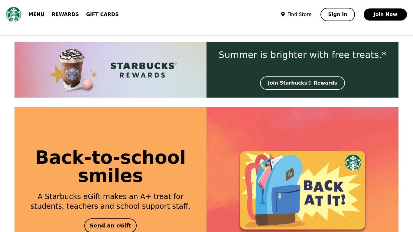
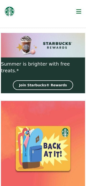
as you can see above two images of my project which show navbar and first hero section in desktop size and phone size respectively
very first you have to add tailwind CSS script to head tag and than you able to use utility class of tailwind CSS
<!-- tailwindcss -->
  <script src="https://cdn.tailwindcss.com"></script>
now below navbar code tell that use flex and flex direction column for all screen size but use flex direction row for medium width and above
<section class="navbar flex flex-col md:flex-row ">
Footer ,Socials and Term and conditon
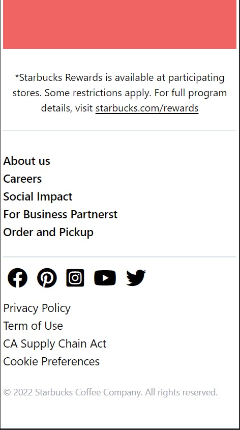
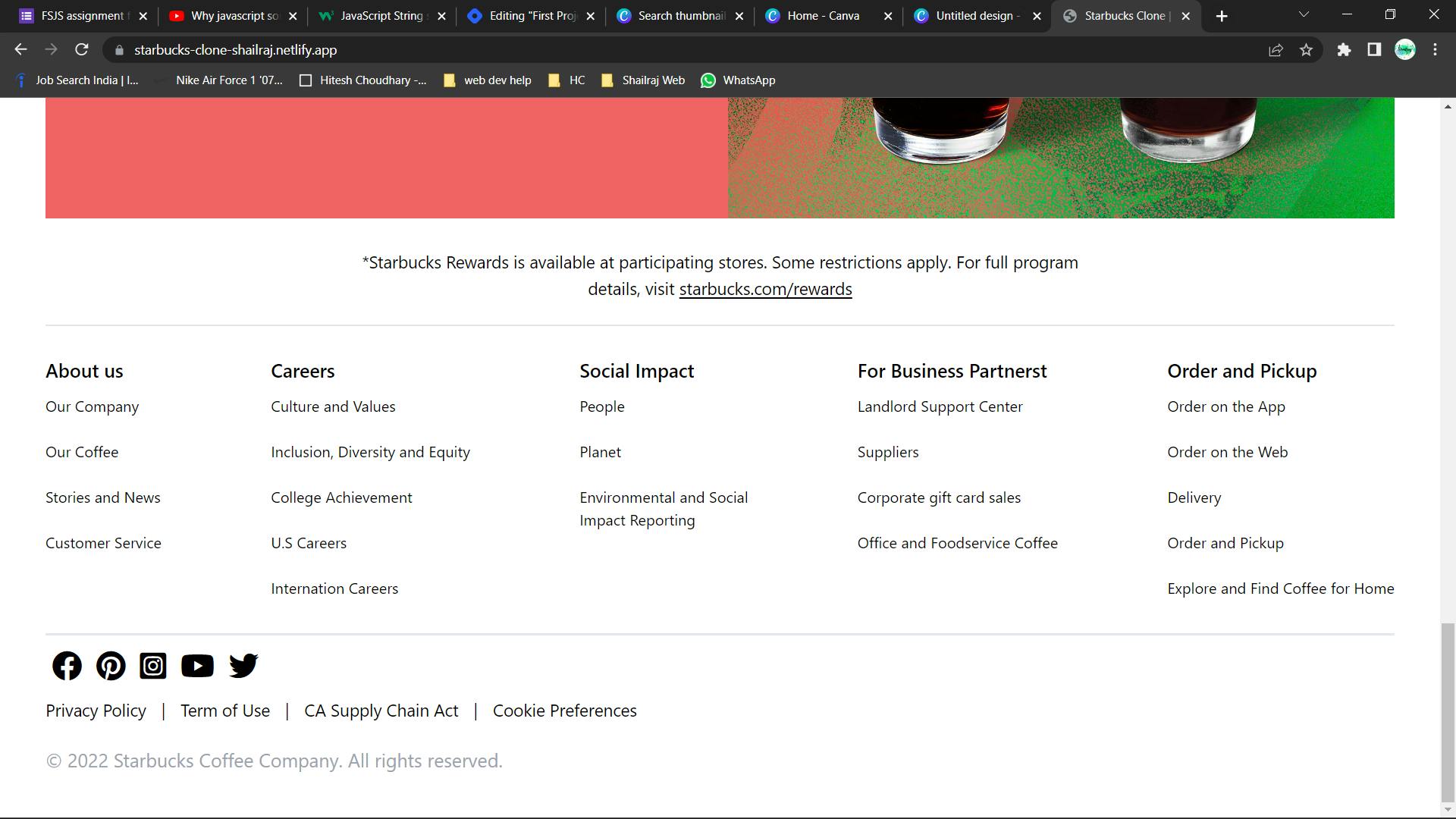
as you can see above two images of my project which show Footer ,Socials and Terms and condition in phone size and desktop size respectively.
below codes line number two say that particular list is hidden for all screen but for medium screen and above it visible in block form
          <p class="text-lg md:text-xl font-semibold text-titleText">About us</p>
          <li class="py-3 hidden md:block">Our Company</li>
Also if you have query or any question about this project you can comment or reach out my socials .
